
Ecoline Brush Pen Blending: A Complete Guide to Colour Blending for Calligraphy
Been admiring beautiful gradient calligraphy on Instagram and wondering how it's actually done?
Today I am going to be playing with some of the Ecoline brush pens. If you follow me on Instagram, you'll see that I've been doing a lot of blending with them and I've had a few requests for a proper tutorial, a real-time explanation of exactly how I do it.
If you’d prefer to follow along visually, you can watch the full step-by-step tutorial here:
👉 Watch on YouTube: https://www.youtube.com/watch?v=wit4fxApEqg&t=1s

Blended Calligraphy Words in Blue and Red using Ecoline Brush Pens
What You'll Need
For this tutorial, I'm using four Ecoline brush pens:
508 - Cerulean Blue
334 -Scarlet
507 - Ultramarine Violet
578 - Sky Blue (also listed as Cyan)
For paper, I'm using a heavyweight cultured paper from Casa London. It has a slight texture to it, which isn't ideal for the nibs, but it's not so textured that we can't get away with it!

The four Ecoline pens laid out. Showing all four colours used in the tutorial.
Part 1: Blending Similar Shades - The Blues
Let's start with blending the blues and write the word "water" which feels very fitting!
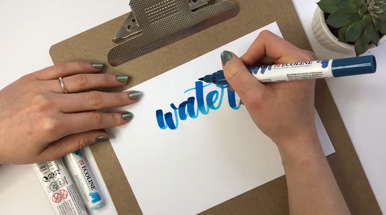
The light-to-dark blending in progress showing the cerulean blue being added over the sky blue
When you do the thick downstrokes with these pens, you'll notice that the ink is quite pigmented at the top and a little more liquidy further down, which actually creates a lovely gradient effect already. But we're going to build on that!
Here's how to do it step by step:
Step 1: Start with your lightest colour.
You always want to start with the lighter colour first and then move on to your darker colour. I'm starting with 578 Sky Blue.
Step 2: Let it dry slightly.
Once you've written your letters, let them dry just a tiny bit before moving on. If you start working too much too soon, especially on textured paper, it can start picking up the paper fibres and it won't look great.
Step 3: Add your darker colour.
Now I'm going in with the 508 Cerulean Blue at the top of each letter. Notice I'm not really pressing down, I'm just lightly shading in. That's because I don't want it to be too liquidy. I'm taking a line all the way along where I want the dark blue to sit, being really careful around the edges.
Step 4: Add a pop of purple.
Before the pen dries completely, I'm adding a little bit of the 507 Ultramarine Violet into the mix. You can see it starting to blend in with the dark blue already, but it's not quite blending with the light blue yet, so here's the trick!
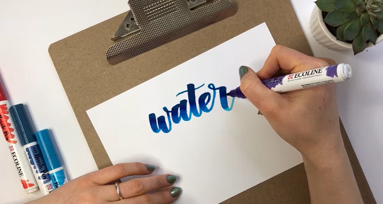
The purple being blended in showing the three colours starting to merge
Step 5: Pull the light blue upwards.
Go back in with your light blue and rather than stopping where you left off, pull it upwards into the darker area. Then bring it back down. You can see it really starting to mix beautifully at this point.
Step 6: Keep working the blend.
The trick with this technique is to work quite quickly. If you can't work quickly enough, just do one shading area at a time. I like to go back over the really nice areas to add a little bit more definition.
Bonus tip: use a paintbrush and water!
Another thing you can do is go in with a paint brush and a little water to blend the colours even further. Just lightly work the water over the blended areas and you can see it blends up really nicely. It's a gorgeous way to blend Ecoline brush pens!
Part 2: Blending Contrasting Colours - Scarlet & Violet
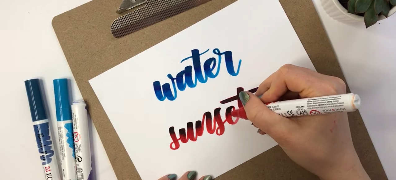
The contrasting scarlet and violet blend showing the bold colour contrast result
Now I just want to show you what it's like when you mix two really contrasting colours because it's a very different experience to blending similar shades!
For this, we're going to use 334 Scarlet and 507 Ultramarine Violet. These are bold, contrasting colours, so the approach is slightly different.
Step 1: Start with the lighter colour.
The scarlet is a bit lighter, so I'm starting with that first.
Step 2: Go in with the darker colour while it's still wet.
Because there is such a big contrast between the two colours, I've actually gone in with the violet while the scarlet is still quite wet. Just go in very lightly at first — you can see it bleeding beautifully into the red.
Step 3: Pull the red up into the purple.
Go back into the red and gently pull it upwards, mixing it in where the edges of the purple sit. It's all about patience and building the colours up gradually.
Key Tips to Remember
Always start with your lightest colour first, then add the darker colour over the top
Work quickly - you want the ink to still be slightly wet when you blend
If you can't work quickly, just do one shading area at a time
A paintbrush and water can help blend colours even further for a softer finish
Be patient - building up colours gradually always gives the best results
If you give it a go, I'd love to see what you create. Tag me on Instagram or share your creation in the comments on YouTube.
Let’s Stay Connected
You can find me here:
Favourite Supplies
Ecoline Brush Pens - https://amzn.to/2uyDmat
Cass Art Heavy Weight Cartridge Paper - https://www.cassart.co.uk/cass-art-heavyweight-cartridge-pad-200gsm-25-sheets/
Some links in this post may be affiliate links. This means I may earn a small commission if you choose to purchase, at no extra cost to you. This helps support Blink Lettering and the free tutorials I share.