
How to Make an Easy Hand-Lettered Father's Day Card (with Gradient Shading, Drop Shadow & Gold Border!)
Want to make Dad a Father's Day card he'll actually want to keep?
With Father’s Day just around the corner, I wanted to show you how to create a really easy hand-lettered Father's Day card. We've got some gradient shading, a drop shadow, and a gorgeous gold border, and it's so much easier than it looks.
This tutorial uses simple block lettering and basic shading techniques, making it suitable for complete beginners.
If you’d prefer to follow along visually, you can watch the full step-by-step tutorial here:
What You'll Need
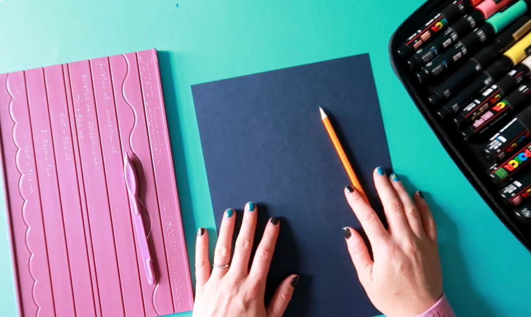
The materials laid out. Showing the Posca pens, card stock, and scoring board
This Father's Day card looks impressive, but it's actually a really beginner-friendly project. By combining simple block letters with gradient shading, a drop shadow and a metallic gold outline, you'll create a handmade card that feels professional without needing advanced lettering skills.
Here’s everything you’ll need for this project:
Blue card stock - Smooth cardstock tends to produce the cleanest results and helps reduce fibre lifting while colouring.
A pencil - I used a Stabilo Aquarellable white pencil so you could see it on camera, but a normal pencil works just fine at home!)
A way to score and fold your card - I'm using the Crafter’s Companion Topscore Multiboard, but you can absolutely just fold the card in half and use something like a butter knife to flatten the crease
Paint markers - I'm using this absolutely gorgeous set of Posca paint markers
For this project, I used light blue, sky blue, black (fine tip) and gold POSCA paint markers, but you can use any colour combination you like. Any good-quality acrylic paint marker should work, although POSCA markers are known for their smooth coverage and vibrant colours.
Step-by-Step: Hand-Lettered Father's Day Card Idea
Step 1: Fold Your Card
Start by folding your A4 card stock in half to create an A5 greeting card. If you're using a scoring board like mine, you'll see it has a "half fold A4" guide - just slide the card in and score along the line. This creates a crease that makes it much easier to fold cleanly without wrinkles.
If you don't have a scoring board, simply fold the card in half and then run something firm (like a knife or bone folder) along the edge to flatten it. This just means you don't get lots of wrinkles when you're creasing the edge.
Step 2: Sketch Out Your Letter Guides
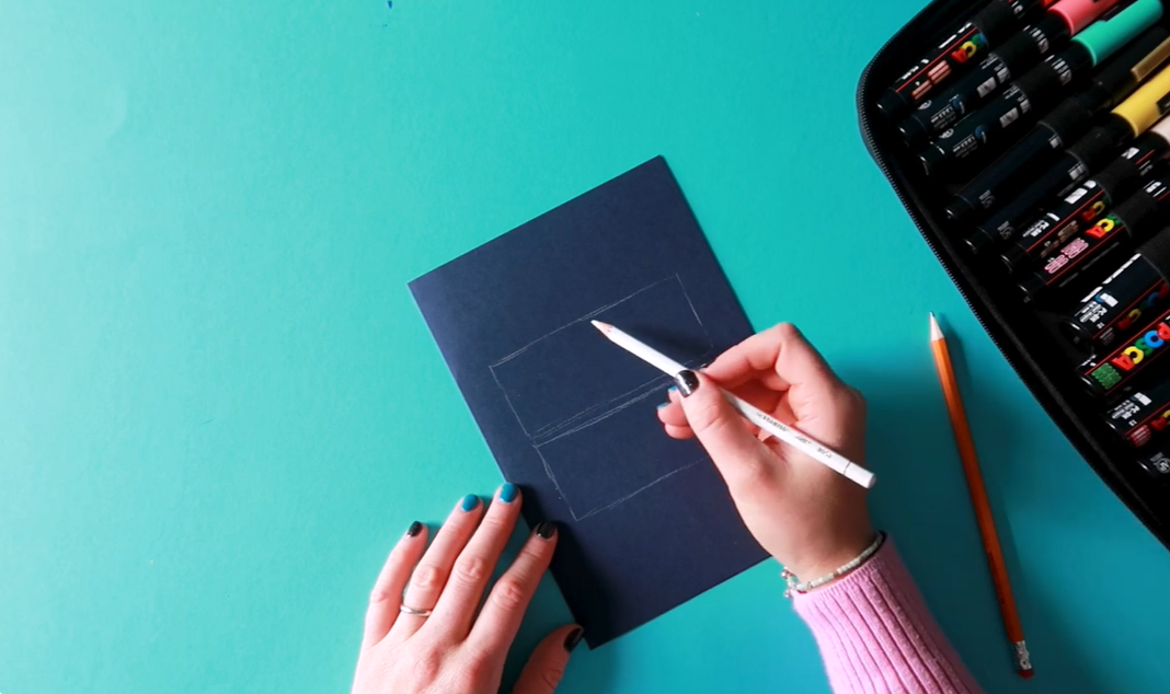
The letter grid being sketched. Showing the rectangles divided into sections
This is a super easy tutorial - you really don't need to be a pro at hand lettering!
We're going to start by lightly sketching out the areas where we want the text to go.
We'll be writing BEST DAD across two lines.
Here's how to map it out:
Draw two rectangles on the front of your card, one for "BEST" and one for "DAD", roughly the same size.
For the top rectangle (BEST = 4 letters), split it in half, then into quarters.
For the bottom rectangle (DAD = 3 letters), split it into thirds.
Now you can see exactly where each letter will sit. Just draw in your uppercase letters into each of those boxes, making sure to leave enough space around the outside of each letter, you'll need that room to thicken them up with the paint pens!
Be very light with your pencil and don't press too hard. You don't want it to make an impression in the card.
Taking a few minutes to plan your layout makes a huge difference. It helps keep your lettering balanced and evenly spaced, which is one of the easiest ways to make a handmade card look polished and professional.
Step 3: Fill in the Letters with Gradient Shading
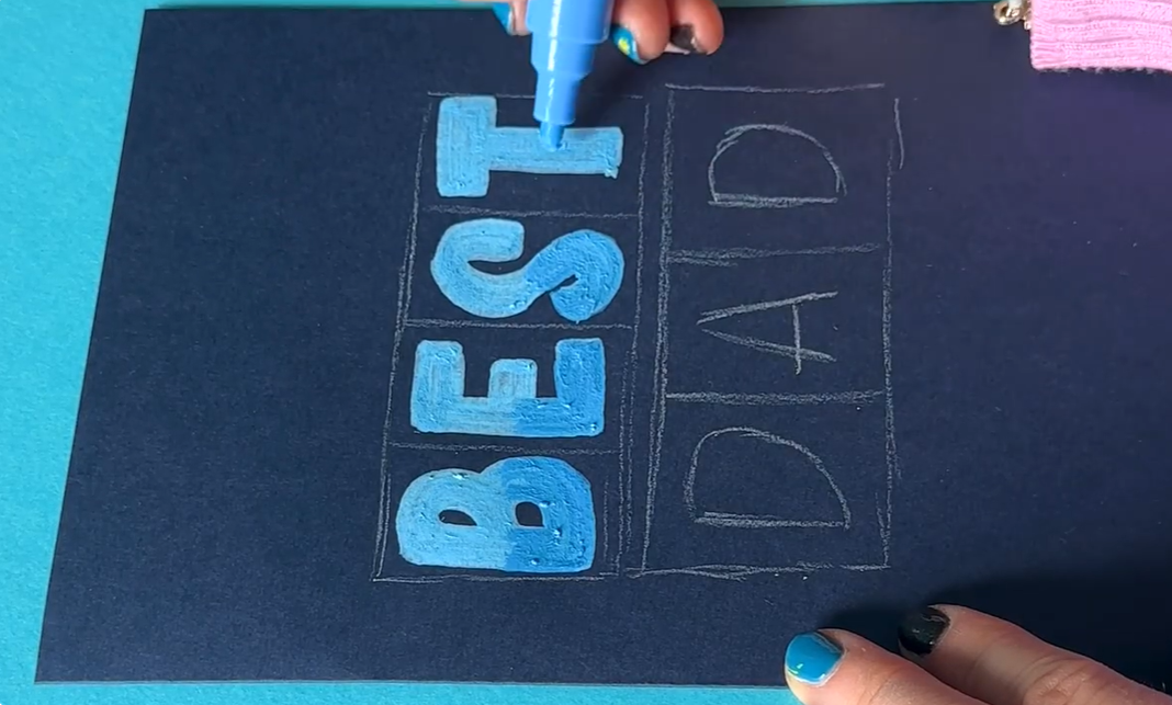
The gradient shading in progress. Showing the light blue and sky blue technique
Now for the fun part, filling in the letters!
For this, we're going to use light blue and sky blue together to create a little gradient shading.
Start with the light blue:
Trace around the outline of each letter
Go around the edge to add an extra line of thickness
Fill in on the inside
Go around the edge once more. You're aiming for about four lines thick
Repeat this with every letter. You'll want the edges of your letters to be quite square (especially on letters like E and T) this will really help later when we come to add the drop shadow.
Top tip: You will notice that some paper fibres pick up as you colour. The rougher the paper, the more this happens. To minimise it, apply one stroke at a time rather than colouring back and forth, and always apply colour in one direction.
Now add the sky blue shading:
Take your sky blue pen and add shading towards the bottom of each letter again, one stroke at a time. You can then blend it out by going back in with the light blue to soften up the edges a little. It just creates a little bit more depth - so pretty!
Don't worry about achieving a perfect blend. Slight variations in colour actually add character and help create that hand-crafted look. The more you practise layering colours, the more natural your gradients will become.
Step 4: Add the Drop Shadow
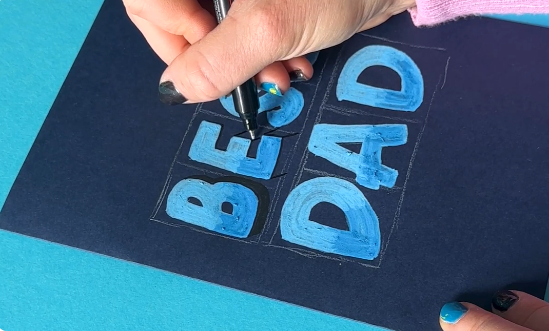
The drop shadow being added. The black pen at 45° angles
For this step, we're using the black Posca pen in the fine 0.7mm tip. The fine tip gives us so much more control when adding in those shadows.
Before you start, you need to think about where your light source is coming from. Let's say the light is coming from the top left, which means the light hits the left and top sides of each letter, and the shadow falls on the bottom and right sides.
Here's the method:
Draw lightly around the bottom and right edges of each letter
From each corner, draw a 45° angle line
Connect those 45° lines with horizontal and vertical lines to form the shadow shape
Fill it in
Some tips for specific letters:
Curved letters (like B, D, S): You only want the 45° angles on the sharp edges. For curves, let the shadow taper out rather than going all the way around.
Letters with inner spaces (like D, A): Don't forget the inner part! The shadow needs to work on the inside of those shapes too.
Letters with multiple parts (like E, T): Work through each part systematically and connect your 45° lines with horizontal and vertical lines.
The shadows don't need to be perfect, but you do want to try and make them consistent with each other. And because we're using quite a dark card, the shadow will be subtle, but it really does make the letters pop that little bit more!
I'd suggest sketching out the shadow outlines on all the letters first, then going back to fill them all in. I'll be honest, I had to circle back to finish the B!
Step 5: Add the Gold Border
The gold border being applied. That gorgeous gold outlining moment
Now for the finishing touch that just takes this card to the next level, a gold border around all the letters!
Take your gold Posca pen and simply outline each letter. If you find the ink is still drying, you may find it easier to twist the paper around as you go.
You'll notice the gold sits really beautifully on the lighter blue areas. Can you see that? It just makes everything pop so nicely in the light. Absolutely stunning!
Step 6: Erase Your Pencil Marks
Once everything is dry, simply rub out all your pencil marks and ta-da! you have a gorgeous hand-lettered Father's Day card.
Just adding that shadow and the gold to the letters really makes them stand out. It looks so impressive, and I promise it's easier than you think!
If you try this tutorial, I’d love to see what you create!
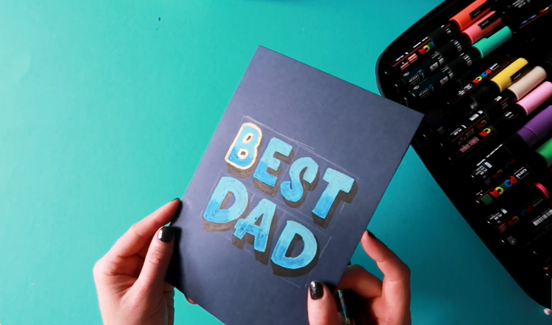
Finished Father's Day Card
And that's it! A simple but effective hand-lettered Father's Day card that combines bold lettering, gradient colour, drop shadows and metallic accents.
Handmade cards are such a thoughtful way to celebrate Father's Day, and once you've mastered these techniques you can easily adapt them for birthdays, thank you cards and other special occasions.
If you give this project a try, I'd love to see your finished card. Tag me on Instagram or share your creation in the comments on YouTube.
Let’s Stay Connected
You can find me here:
Favourite Supplies
Some links in this post may be affiliate links. This means I may earn a small commission if you choose to purchase, at no extra cost to you. This helps support Blink Lettering and the free tutorials I share.